Resources
Brand kit
The logotype, the icon, colours, type, and images for anyone writing about Tack.
The logotype
The logotype is "tack" in Archivo, Expanded ExtraBold, with one change: the right arm of the t's crossbar flies as a pennant. The pennant is the boat's pennant on the home page, and the flags on the app's mast, where every quote is a pennant at its rate.
The letters take the colour of their ground, cloth on sea and ink on cloth; the pennant stays signal yellow. Where only one colour can print, the pennant takes the letters' colour. Don't redraw, stretch, outline or recolour it.
 Logotype, clothlogo-cloth.svg
 Logotype, inklogo-ink.svg
 One colour, clothlogo-mono-cloth.svg
 One colour, inklogo-mono-ink.svg
 Icon, seaicon-sea.svg
 Icon, inkicon-ink.svg
 Icon, clothicon-cloth.svg
 Icon, 1024 px PNGicon-1024.png
Colour
Five colours, each with one job. Signal yellow marks fixed rates and the pennant, and nothing else, so a reader can trust that yellow means a rate that will not move.
Type
- Archivo, Expanded (width 125) and ExtraBold, for headlines and the logotype; Archivo at normal width for text.
- Azeret Mono for numbers, rates, addresses and labels, with tabular figures.
Both are free under the SIL Open Font License, on Google Fonts.
Images
Every Tack image is built from the same few pieces, drawn in code rather than generated: the sea as a field, wind as short slanted streaks, the year of SOL funding as the water's surface, the boat with its pennant, the mast with quote flags, the signal flags for T, A, C and K, and a cloth ticket with an ink shadow. Numbers in an image are real and say where they come from.
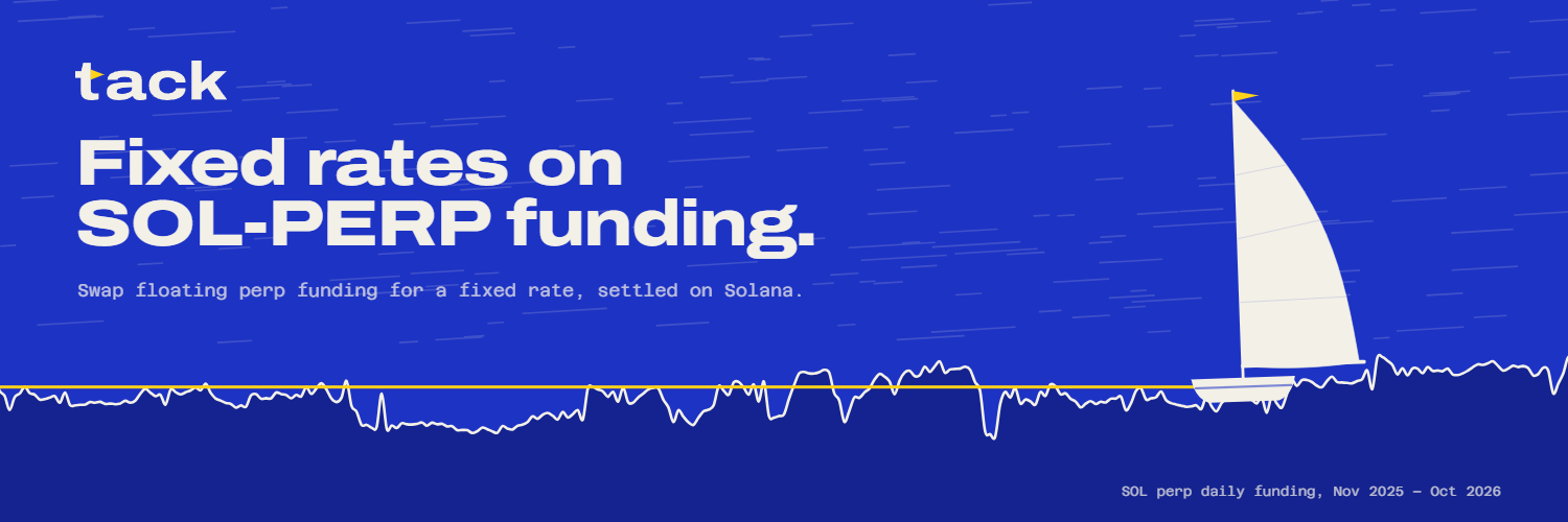 X headerx-banner.png · 1500 × 500
 X profile picturex-avatar.png · 400 × 400
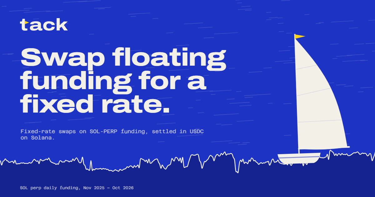 Link preview, homeog-home.png · 1200 × 630
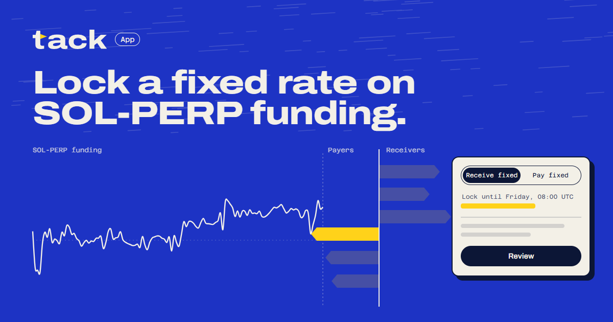 Link preview, appog-app.png · 1200 × 630
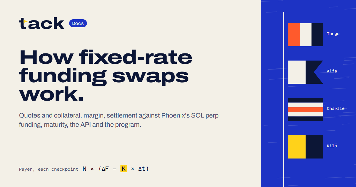 Link preview, docsog-docs.png · 1200 × 630
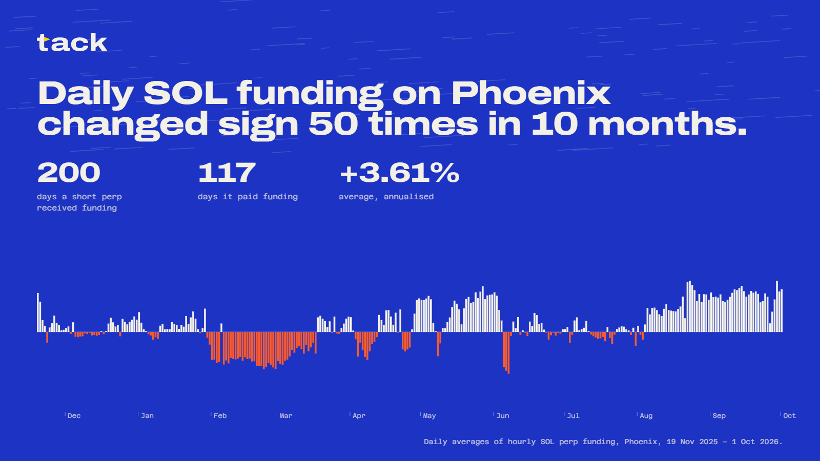 Post: a year of SOL fundingpost-year.png · 1600 × 900
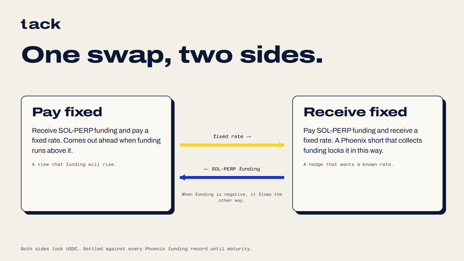 Post: two sidespost-sides.png · 1600 × 900
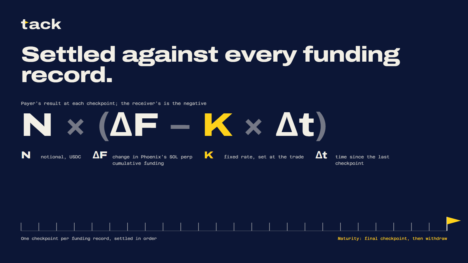 Post: settlementpost-settle.png · 1600 × 900
The compositions live in web/brand/. npm run brand in web/ redraws every logo file, icon, favicon and image from the same geometry and the same funding data the site uses.